Buddy

No Comments »

This is an old post from 2023 that I never got around to putting up.

I had a bit of surgery a few years back and despite the ups and downs around that, I decided to make a painting for my surgeon to say thanks (as if the $$$$ I paid him wasn’t enough, lol). Spoiler alert: he loved it.

At the time, I was playing around with a new to me technique where you drip paint on the paper and use a squeegee to pull it down and make abstract shapes. You can also use a credit card to further manipulate the paint and get some interesting shapes in. This project deviated from that significantly lol.

I knew I wanted to do a portrait of his dog, Buddy, so I stalked his personal IG and found a great picture of him. The first step was to use my Cricut to cut out his name, and center it in the middle of the paper. The original image is of the him in the forest, so I tried to get tree looking sticks in the background with the squeegee paint, but I hated it and it just didn’t achieve the look I was going for. Not wanting to waste the paper, I flooded the squeegee with blue and white paint, and with a few strokes, got a great streaky sky looking background.

Then I went in with a dry brush and tried to mimic a green bush around his name, but it was too dark and just looked like a green blob. So I flooded the squeegee with green and white paint, and pulled it along the bottom. Then I pulled the lettering off to reveal the white paper beneath it. The paint was all still wet so it mixed nicely. I let it dry a bit, then went in with brown on a credit card, and scraped a line down on the left, and pulled that to the right before running the card up and down again. It’s an easy and fast way to create texture, and when a bunch of them are lined up, they look like trees.

Then I taped the reference image on the table, and taped the front of the frame (a record frame since he likes music as much as I do and the image was from IG so it’s square anyway), and traced the outline of the dog with black and white Posca paint markers. I picked them up for a similar project I did for my mom, and really like the control you can have with them. Originally, I was going to leave the dog see-through and only do an outline, but it was severely lacking something, so I painted his copper muzzlepouche. It made it look like he had this huge mustache, which like, fine, but when it’s portrait, it has to be bang on otherwise it just looks off. It did, so I added the beard and tried again. This time, it was very clear that the writing wasn’t centered to the dog, and the trees going through the left side of his head just looked weird. I wanted to bring him front and center more.

I played around on my phone and found that filling it in with 40% opacity helped make that distinction, so I headed to the art store to get grey paint and some transparency medium. It didn’t do what I wanted, and ended up with really streaky results, so I decided to just go full opaque with it.

I struggled with the lettering, which is normal for me. I couldn’t figure out how to match it to the glass properly, so I tried tracing with the paint marker on the outside of the glass, and painting with paint on the inside. This wasn’t great, and resulted in squiggly text with uneven thickness. Then I laid the glass on the paper and lined up the lettering from the outside, and pained the inside with the marker and then paint. It went okay, but it was still off a bit because it’s nearly impossible to line two stencils up like that. I think the next one I do, I’ll cut a mirror image of the name so that I can line it up exactly, then paint around it. You can still see a sliver of green underneath, but I think it looks okay.

The collar also had some issues. I used the paint marker to do the design, but I did it rough and quick, and some of the black came off when I painted the teal on top. I don’t think it’s a huge issue, and I didn’t care enough to go back and take up all the paint to fix it. I also thought about adding gold to the tags, even though they’re silver, but I figured I’d be fucking with it forever, so I put a stop to that and focused on the lettering, which I ended up fucking up anyway, but whatever. Sometimes you have to call it and just put the brush down.

Once I was done, I flipped it so the inside painted glass was up against the painted background, and framed it in the rest of the frame.

I was a bit sad to lose that tree behind his head on the left, but I think the image is better centered, and the tree doesn’t pull away from the face as much. And he’s really front and center now. Anyway, I’m a lot happier with it like this. I know it’s weird to give your surgeon gifts, but sometimes I see something, or I get an idea for something and I have to make the thing. If he doesn’t want it, I’d understand and wouldn’t be butthurt. I had a hairstylist once refuse a portrait I’d done of her cat (she didn’t see it but didn’t want it). No problem. I was going to re-use the canvas (because who wants to put a pic of someone else’s cat up?) but I ended up using it as a test for resin coating, and it’s up in the kitchen, under one I did of Tug.

Posted on April 27th 2026 in Paintings

Missy kinusaiga

No Comments »

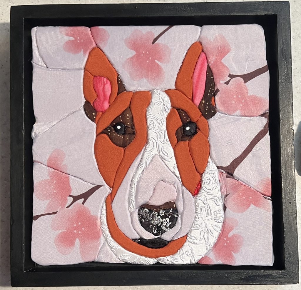
I learned a lot from my Lala piece, and I thought I’d tackle doing a portrait of the OG bull terrier, Missy. She belonged to a friend of mine, and is what made me fall in love with the breed, eventually leading to adopting my own bull terrier, Tug.

The lady who posted the original IG reel I saw had created a tut on how to make a stencil and handle the eyes, which I struggled with on my Lala piece. Would have been nice had I seen that BEFORE I started the Lala one, but timing be what she be.

I cut the foam and sticky tape to size, but I need to find a better foam cutting method (without using a hot wire) because I can’t seem to get my edges straight (hah!) or smooth.

I started off using my mom’s BF’s iPad to trace the stencil. Using Guided Access, you can turn off touches to the screen to prevent the image from moving around. Frustratingly, I managed to trigger some magnifying loupe thing, and then couldn’t restart the iPad, but that’s neither here nor there, just something to think of if you want to use Guided Access.

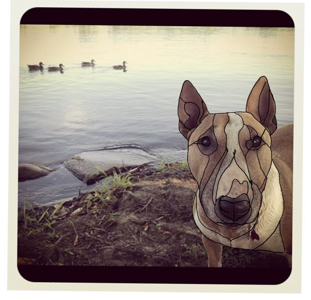
Using a free iOS program similar to Procreate, I made loose shapes and didn’t overly worry about the details. Missy had a lot of interesting features, including her tiny little ears, and I wanted to make sure I captured the difference in colour and fur texture.

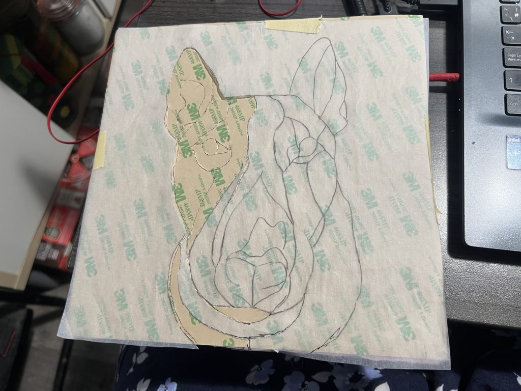
Then I traced those shapes onto a sheet of stencil paper. I taped it to the foam, and using a scalpel, cut out the shapes, leaving the sheet of paper over the sticky part.

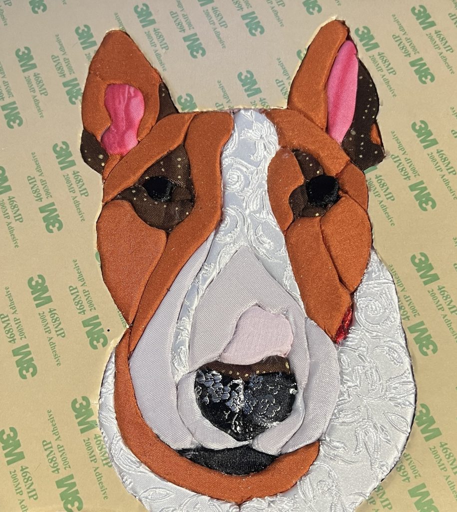
Then I went through the fabric I bought at VV (and washed in hot water, natch) as well as what I had on hand. Technically, her colour is what’s called smut, and finding a big huge chunk of fabric in that exact colour is hard, but I went with this bed sheet. I already had the pink, black, brown, curly white, and red fabric on hand. I wish I’d used more artistic licence to extend the red fabric (her collar) so the pattern was more visible. It’s Chinese brocade silk with dragons on it. I failed to realize that the sliver of red would be even smaller once I was done tucking. I could have extended that up farther and thicker, but anyway.

Then, section by section, I took off the paper, exposing the sticky side, and cut pieces of fabric around the paper side. With a stitch ripper, I tucked each bit of fabric in around where I had cut the line. Once you start tucking, you can trim the excess with scissors or a nipper.

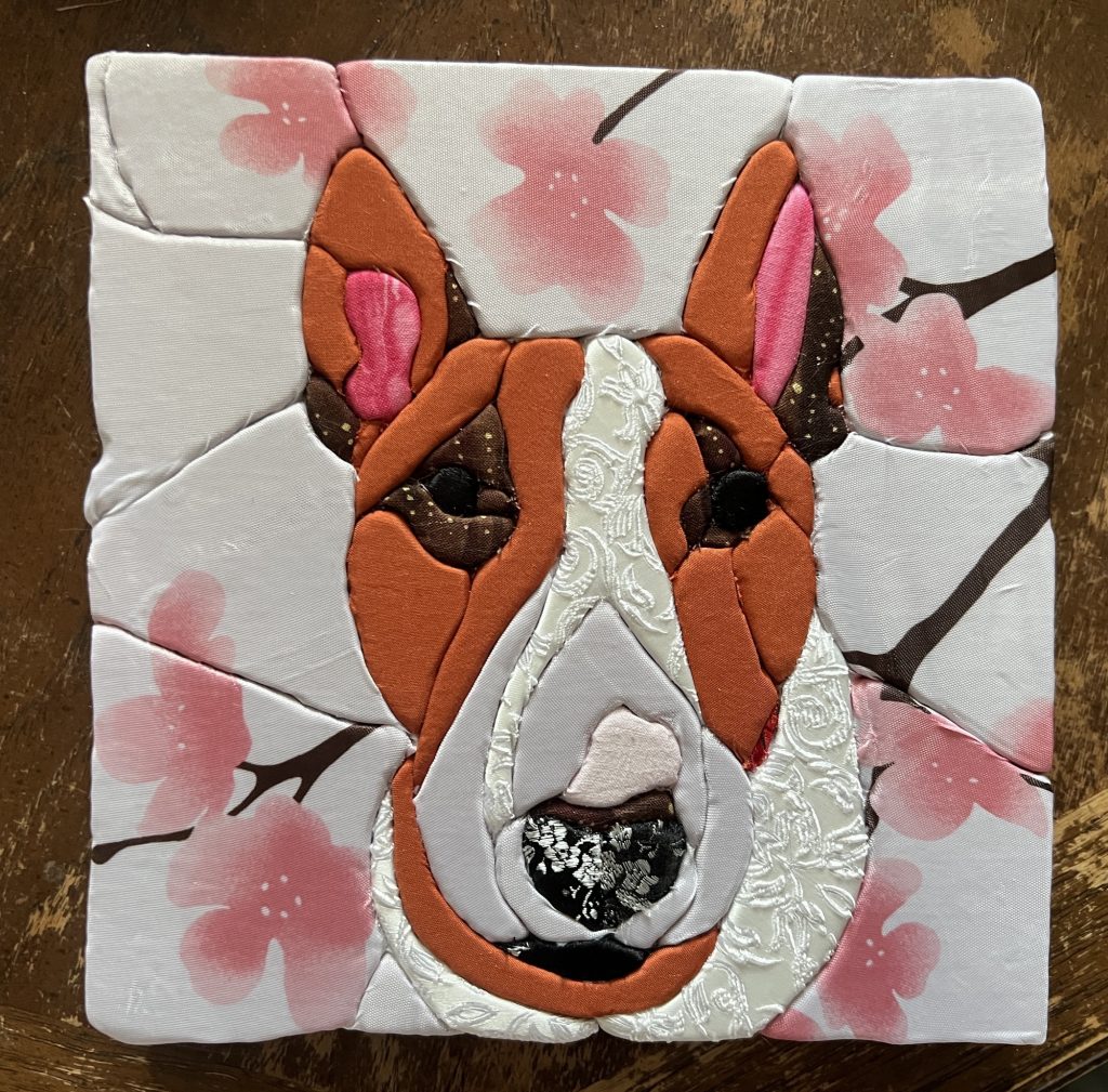
I wanted to capture the different textures, and colours. In the picture, her fur is wet, ostensibly because she was just in that stinky lake (she was like that), so I used the curly white fabric to show fur texture, and break up the whites. Making a lot more individual slices was WAY better than just doing one flat face like I did for La.

As I was looking for fabric at VV, I came across this cherry blossom shower curtain. I didn’t even bother looking at it, I just grabbed it right away. I knew I wanted it for the background, but I was slightly concerned that the blossoms were too big. They weren’t.

Learning from the Lala piece, I cut the edge pieces about an inch longer than necessary. Then I went along and extended the cut to the edges, and tucked the fabric in. I tried to overlap it so that if there was one shorter side, it got tucked in by the longer side, if that makes sense. Then I used some of the off cuts of sticky paper to adhere it to the back, and used painter’s tape to stick it all down. On the back, I used the rest of the sticky tape so I can mount it to the frame.

There are some weird tucks and folds in the fabric, but it IS a fabric craft, so I think that’s allowedsies. Also, the shower curtain was so delicate and would run if you looked at it sideways, but I think it worked pretty well in the end. In order to have a continued blossom or tree branch across a seam, I had to find two that were similar (which was impossible since the pattern was non-repeating), and then position them in such a way to look like they’re one. I had originally bought pink satin fabric for her nose, but I ended up pulling it off (and also the sticky, so I had to re-cut that piece) because it was too similar to the white from the shower curtain above her nose. This was a piece of leftover pink and red polka dot fabric that I had on hand, but if I were to do this again, I would probably try using the blossom from the shower curtain. I used the white from the shower curtain for the bridge of her nose because it was a bit see-through, and her that part of her nose isn’t entirely white white.

You can see that the block is a little wonky, but like, whatever. I can’t do anything straight, and everyone knows it. At this point, she was still missing white paint dots for reflections in her eyes, but it’s essentially done.

I had bought some frames at VV, but realized they were the wrong kind of frames and would require too much work to retrofit into what I wanted. Instead, I found three of these ones where the image is set at the back of the frame. You want it set in as deep as your foam so the piece is flush with the front of the frame. My foam was 1″ deep. This frame was in pretty rough shape, so I washed it down and sanded it with a magic eraser to get some of the grime off. Then I painted the back and sides black. I will probably leave the background as-is, because the piece should cover it. You can’t tell from the picture, but it’s sorta glossy and I don’t really want to fuck with covering that properly. I also coated it in glossy Mod Podge, because the black acrylic is just going to be flaky and I don’t want it to scratch or come off. On that note – anyone have tips for a streak-free finish? I tried watering it down a little, and did thin coats, and even tried using my finger, but it’s still rougher than I’d like. Anyway.

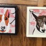
And here’s the finished piece! I’m pretty happy with how it turned out, all things considering. I still think her nose isn’t pink enough, but I don’t want to undo it a second time. I am often guilty of picking at a project after it’s done, then wrecking it as a result. I think the background is more dynamic than my first one, and I think more sections = better result. You can REALLY tell that the cut isn’t even/smooth, so I am looking into a heated foam-cutting tool so I can fix it on my next one. In any event, I hope my friend likes it!

Posted on April 24th 2026 in Dogs, Kinusaiga
×